Grocerly: Conversion-Focused Grocery Delivery UX Redesign
End-to-end UX overhaul for a grocery delivery platform—simplifying discovery, clarifying fees, and streamlining checkout to drive conversions.
SCOPE
What We Did
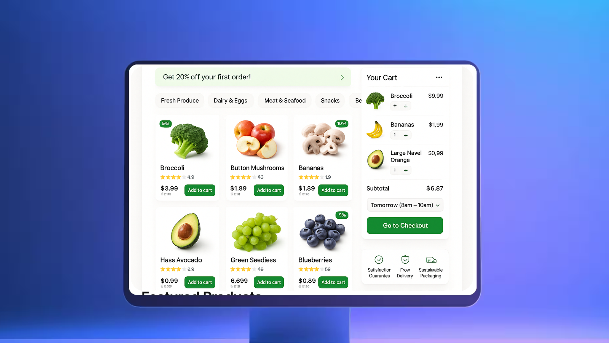
Navigation & Discovery
Rebuilt information architecture with faceted search, smart sorting, and clearer categories. Introduced personalized “Buy Again” and recently viewed modules.
Checkout Simplification
Reduced steps, added progress indicators, clarified delivery windows & fees, and improved address/payment flows with inline validation.
Clarity & Trust
Contextual help, transparent pricing, and improved empty/edge states. Reduced cognitive load through consistent patterns and copy.
Design System & Accessibility
Cross-platform component library with tokens, states, and documentation. WCAG 2.1 AA fixes across color, focus, semantics, and keyboard navigation.
Outcomes Delivered
Add-to-cart rate ↑ 18%
Checkout completion ↑ 26%
Task completion time ↓ 32%
Support tickets about checkout ↓ 24%
NPS ↑ 21 points
App ratings stabilized at 4.7★
BRIEF
Grocerly is a fast-growing grocery delivery platform serving multi-city markets with peak evening and weekend traffic.
Goal: increase conversion and satisfaction by making it easier to find items, understand fees, and complete checkout on the first try.
CHALLENGE
Deep category hierarchies and inconsistent filters made product discovery slow and frustrating on mobile.
Checkout friction: confusing fees, unclear delivery windows, and brittle address/payment steps increased drop-offs.
Inconsistent UI patterns across web/iOS/Android and accessibility gaps leading to avoidable support volume.
Grocerly adopted a research-driven redesign anchored in clarity and speed:
UX RESEARCH & BENCHMARKING
Intercept interviews, task analysis, and funnel telemetry informed hypotheses. Competitive teardown and heuristic reviews prioritized fixes with highest conversion impact.
IA, SEARCH & PERSONALIZATION
Introduced faceted search, auto-suggest, and relevance tuning. “Buy Again” and personalized shelves boosted repeat purchase speed.
CONVERSION-FOCUSED CHECKOUT
Streamlined steps with progress cues; clarified fees, promos, and delivery windows; added inline validation and save-for-later payment/address.
DESIGN SYSTEM & ACCESSIBILITY
Tokenized components (web + native), usage guidelines, and QA checklists. WCAG 2.1 AA remediation across color contrast, roles, labels, and focus order.
Key results & impact
The comprehensive strategy delivered exceptional results across all key performance indicators, positioning Grocerly as a leader in its market.
Checkout Completion
Clearer steps, validation, and delivery/fee transparency reduced drop-offs.
Add-to-Cart Rate
Faceted search, smart sorting, and personalized shelves sped up discovery.
Task Time Reduction
Fewer steps and better defaults shortened time-to-order on mobile.
App Store Rating
Consistency, accessibility, and clearer flows improved perceived quality.
Clarity Drives Cart Value
By reducing cognitive load and removing friction in discovery and checkout, Grocerly increased conversion and user satisfaction while lowering support burden.